Cord Forest

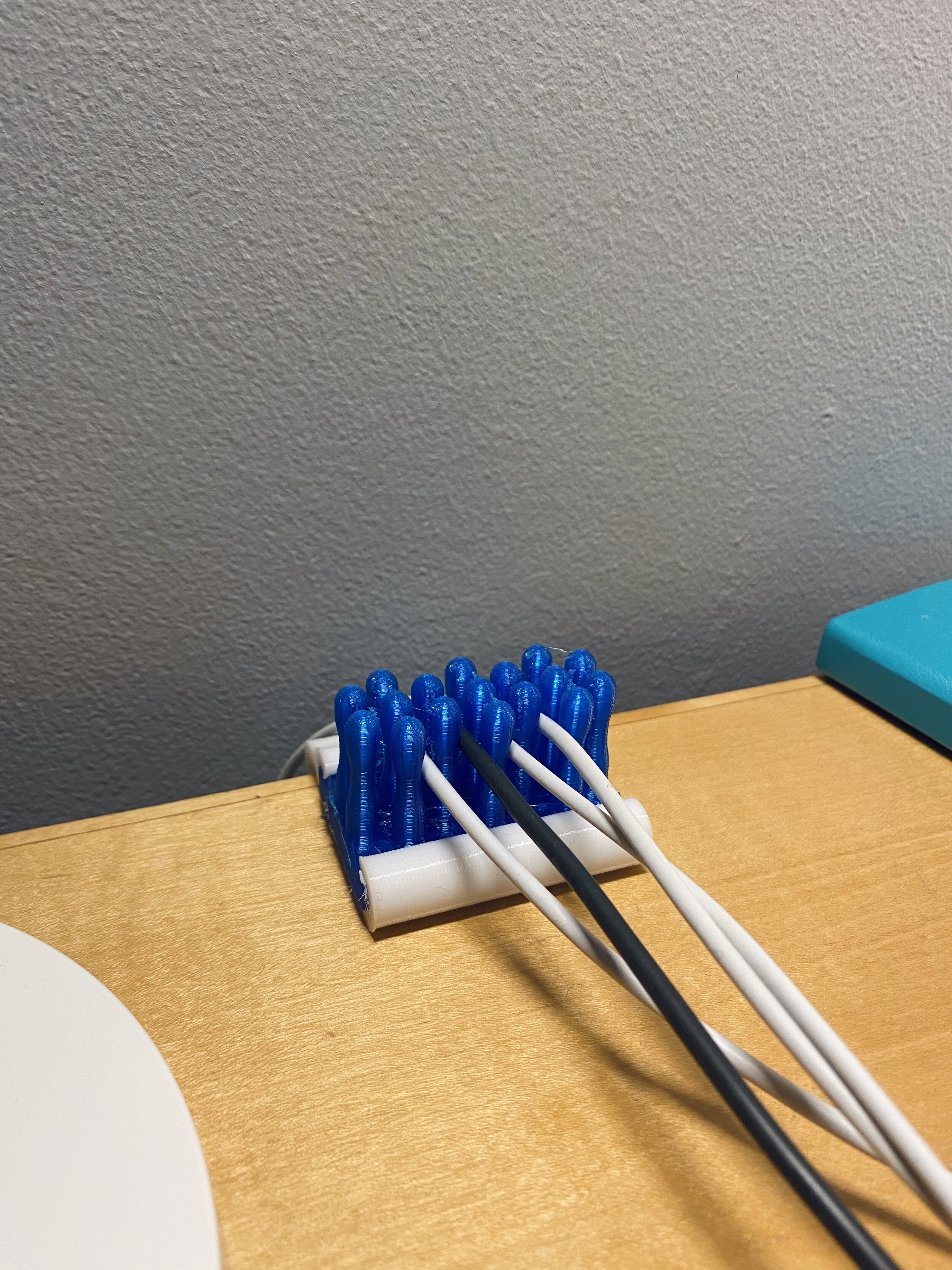
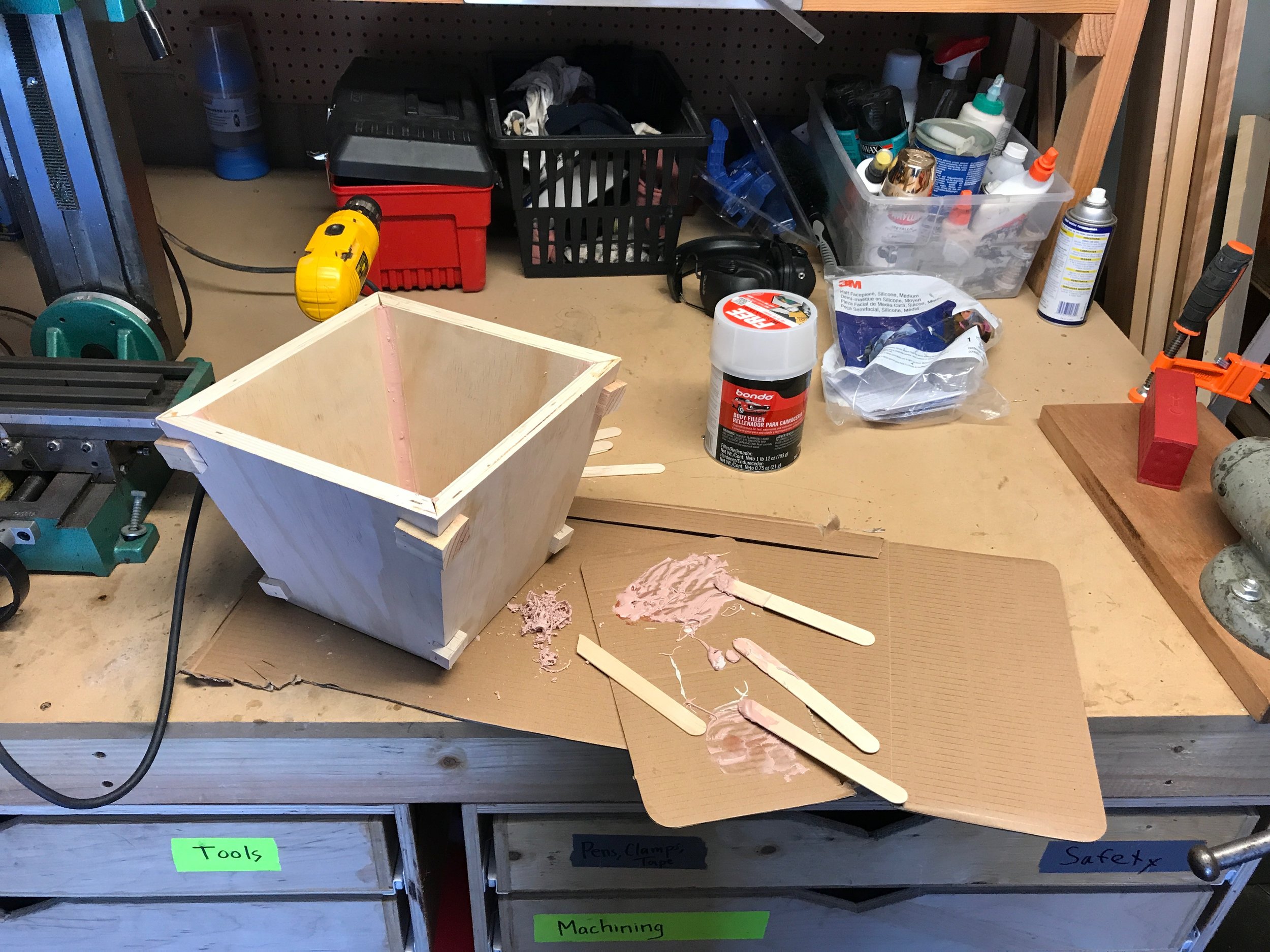
Working from home has made me increasingly sensitive to clutter on my desk. I have a bunch of cables that mostly stayed put, but I figured I could do better. There’s lots of cord organizers available online that “pinch” cables between elastomer “fingers”. I’ve been wanting to modify my 3D printer to print TPU for a while, and this seemed like a great starter project.

As with all things 3D printing, however, one thing led to another, to another, to another… flash forward a couple of weeks and I’ve spent most of the time printing replacement parts to improve my machine just to get it to print TPU successfully. It ended up being a longer path to get there in the end, but it feels great to have tinkered with the little robot and increased its capabilities just a bit more.

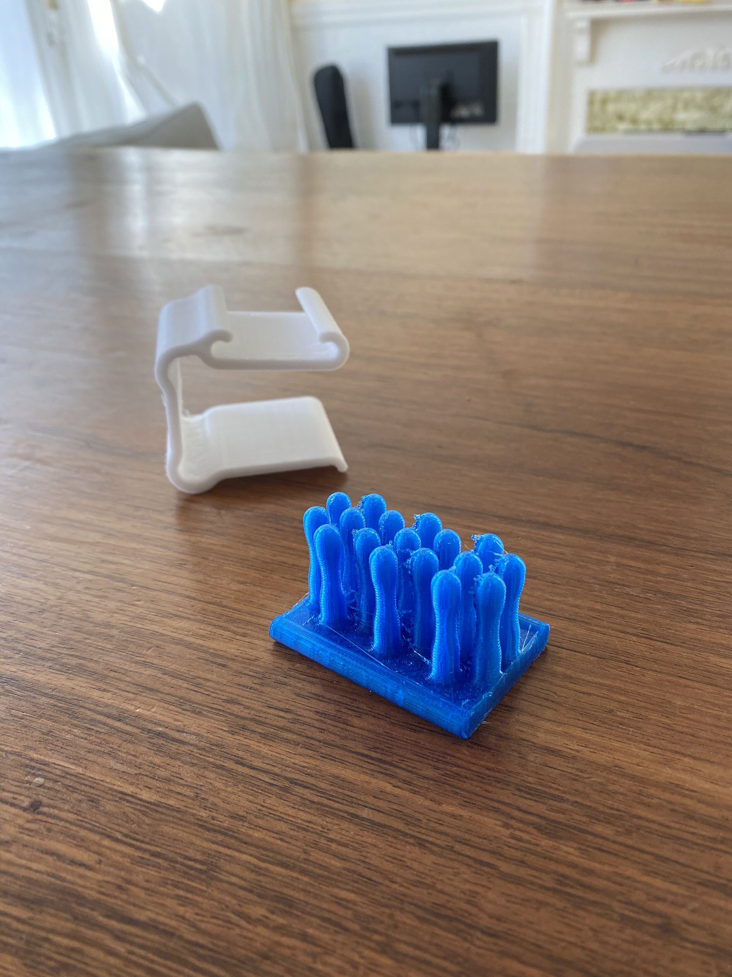
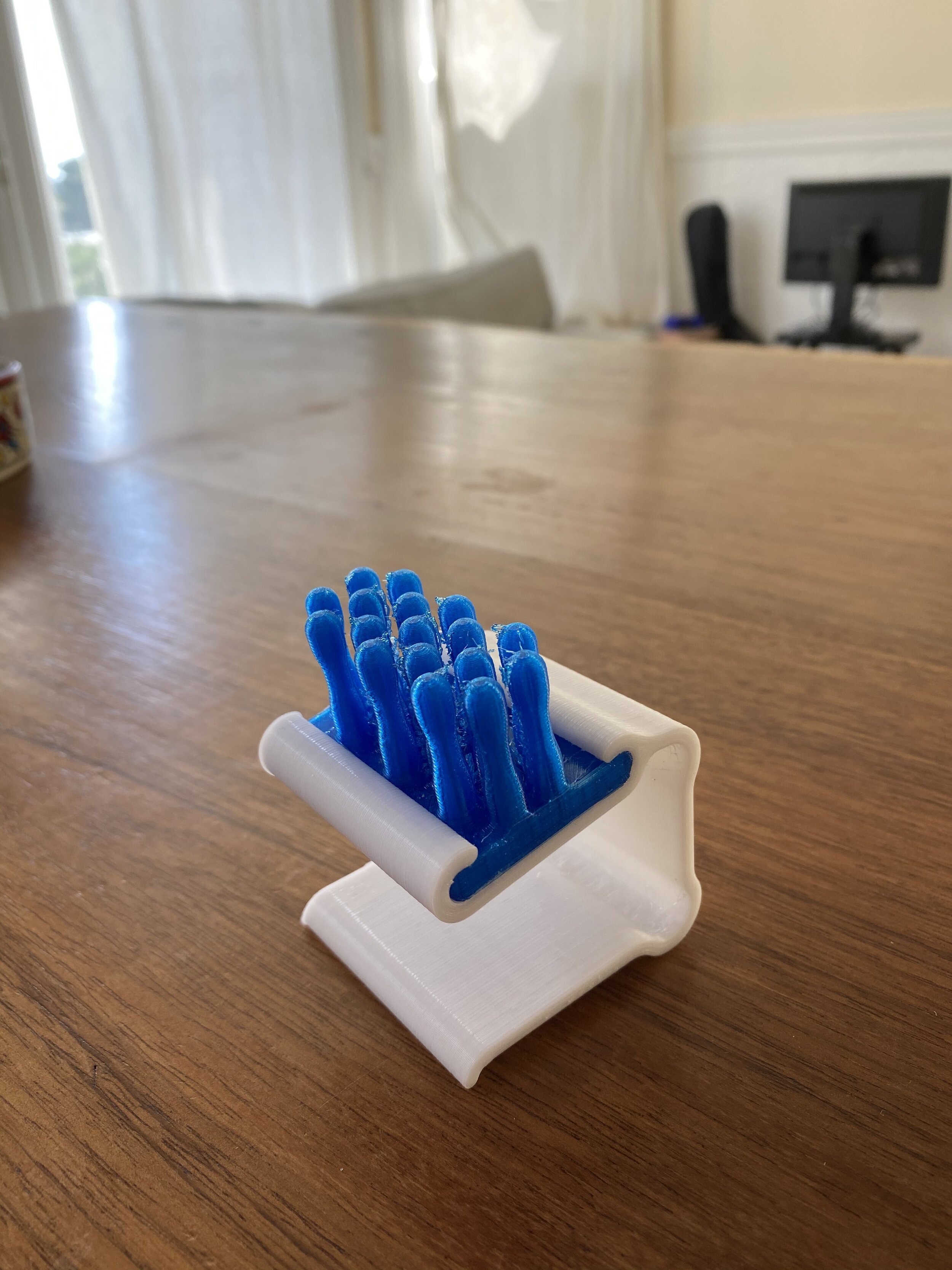
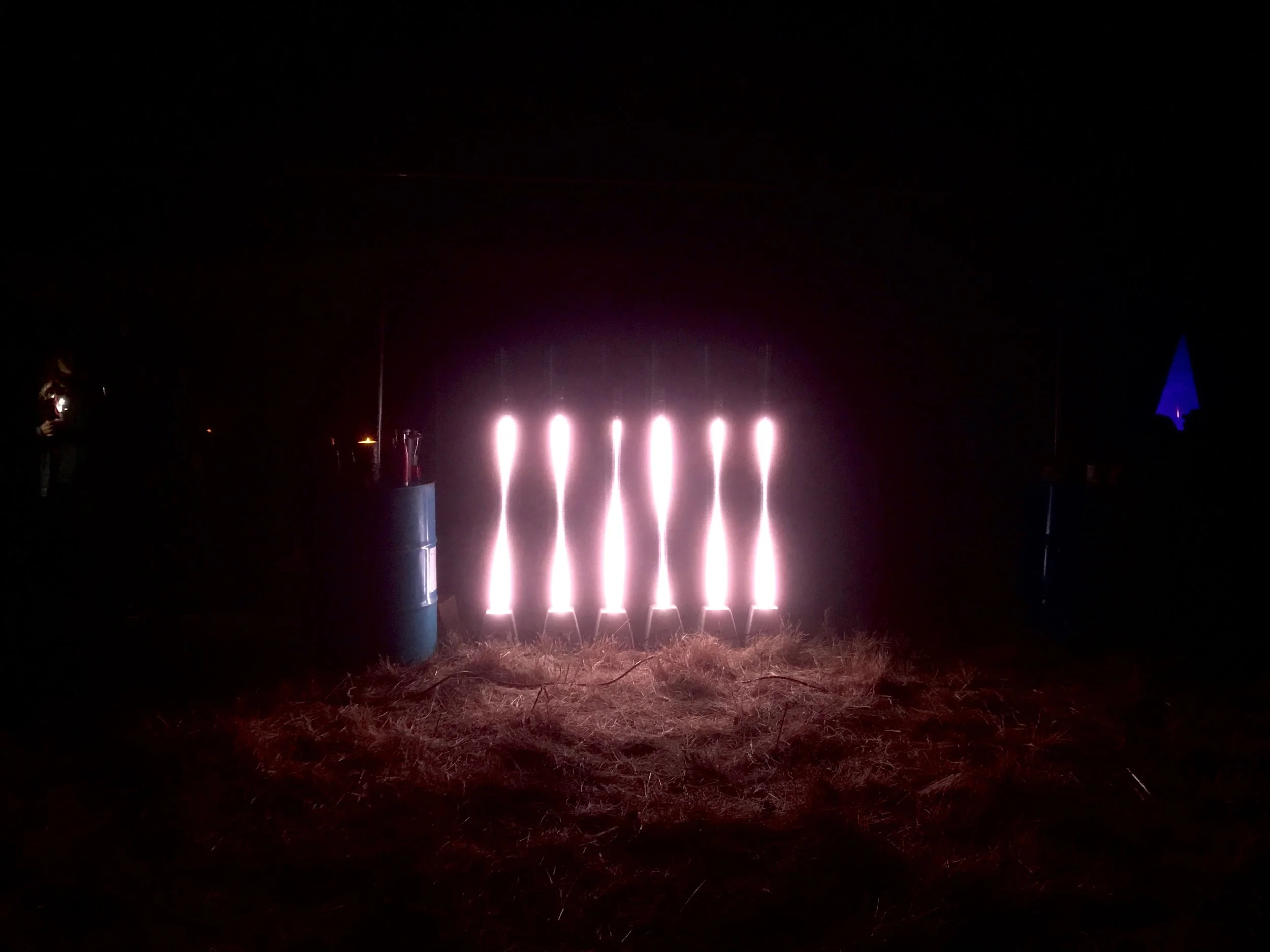
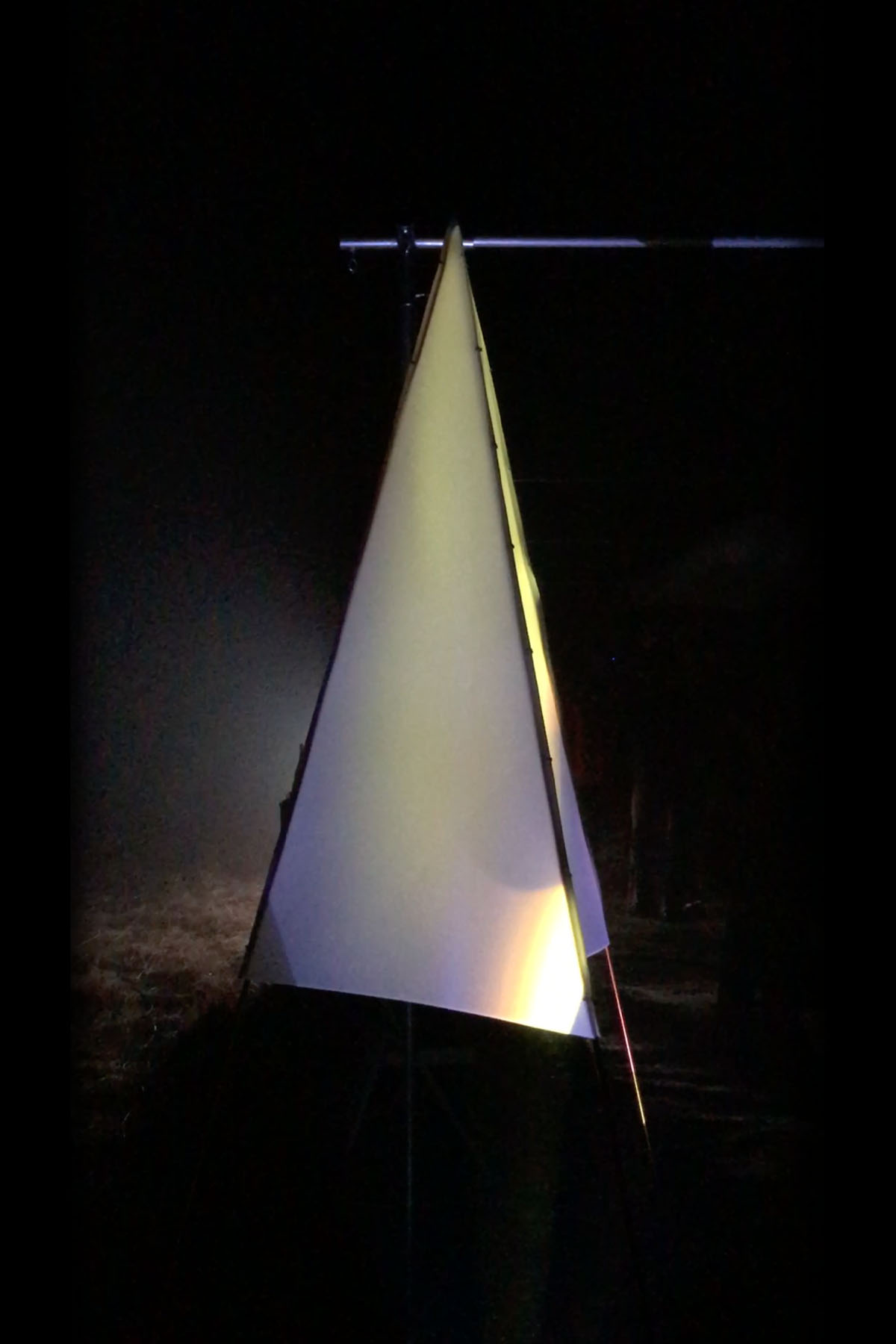
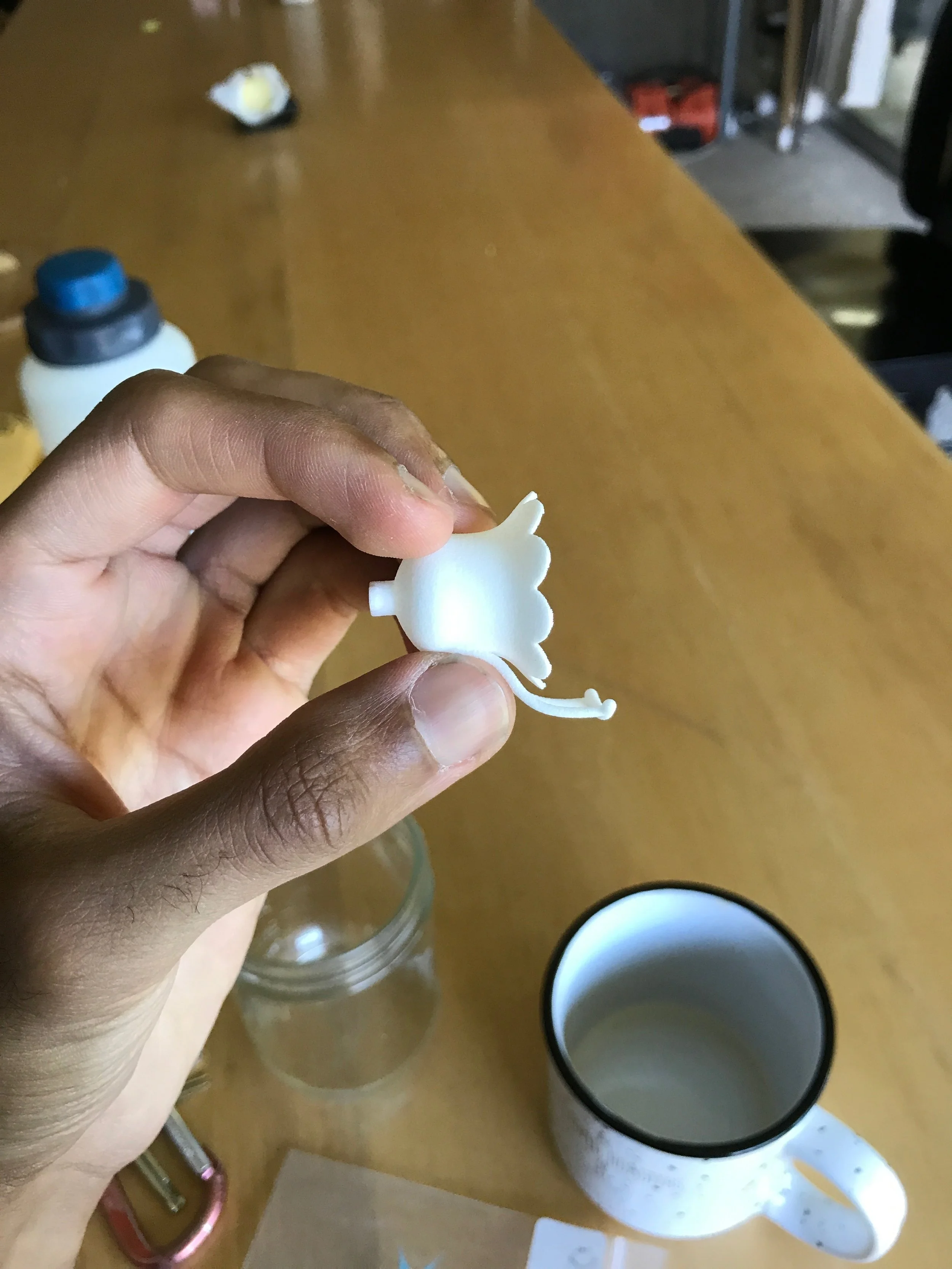
The “cord forest” of TPU “fingers” slots into a PLA spring clip that grabs the edge of my desk. I added a bit of adhesive-backed rubber to keep the clip from sliding around.

Mask Hooks

A quick little 3D print for hanging up masks in the age of COVID-19. The mask hook “S” has 2 different inner diameters to account for two different outer diameters on the curtain rod.

STL available here for a curtain rod with an OD pair of 12.75 mm / 16.0 mm.

Joji's Portal

I've been researching other digital artists a fair amount of late, and I'm blown away with the quality of work that exists in the world. So many people are pushing the limits of what I've ever thought of, and it's incredibly humbling to see how much is being done all around me. 

A lot of my research has been centered on audiovisual artists. I've always been interested in creating responsive/interactive pieces that organically play with whatever sounds they hear, but I started to notice that some of the more compelling work I was seeing seemed tailor-made for specific songs or sounds. I decided to take a shot at this myself and focus on creating a "music video" of sorts.

I just started listening to Joji on the recommendation of a nice dude at B-24's Espresso Bar, and I'm really digging his music. I wrote a little bit of code in Processing and recorded a live performance of me creating a simple visualization in time with the song. I then loaded the resulting video into Premiere Pro and pushed and pulled it into its final form.

This is a totally new medium for me - please let me know what you think!

Font Explorations

I've been developing part of a font for use in a new business card design. I've been trying to develop the letters out of simple geometric shapes. Most of it went by relatively smoothly, but I got really hung up on the lowercase [e] and [s]. I was trying to figure out why these letters in particular were so challenging, and it's been a fun exploration to dive a little deeper into the geometry of characters.

First, some background. The first letter I built was a lowercase _i_ since it's the first letter on the card. Here's an image of that character.


The next letter I built was the lowercase [o]. I based this letter on the first character I made. The height of the outer circle of the [o] is matched to the height of the "stem" of the [i]. The stroke of both letters is matched as well.


These constraints forced the "hole" in the [o] to be smaller than the stroke width of the characters. Remember this for later!


I designed most of the other letters in a similarly logical manner. Stroke width was locked by the [i], max height was set to the top of the dot, and "base" dimensions were locked to the [o]. See below for examples of [b][c], and [n].


Most of the letters went by without incident, but I had trouble with [e] and [s] as I tried to hold true to my constraints. I couldn't figure out how to fit in the negative space of the [e] or the bend of the [s]. Let's turn to Futura Bold to try and gain some perspective. Paul Renner seemed to have plenty of space for the geometry that was confounding me. Did he follow the same rules?

Whoa, damn. Not at all. I guess that makes sense - there's just not enough space to follow the stroke width and height constraints that I artificially imposed. The Futura [e] has a narrower upper and lower section to make room for the taller area needed by the stacked negative space and horizontal bar of the letter.


 Let's go back to my font and look at it again. The [o] is built of two distinct spatial blocks (highlighted in red and blue below). Let's define some units: the red block is "one stroke" and let's call the blue block "one nub". The "nub" unit is a driven dimension - that is, it's a value we ended up with after constraining the height and the stroke width. Turns out that one "nub" is about 0.8x of one "stroke" - one "stroke" is about 1.25x one "nub"). The [o] is 2 strokes + 1 nub in both X and Y (it's a circle). If we just convert to "nubs", this means that my circular [o] is 3.5 nubs tall.

The problem with the [e] quickly becomes apparent. Let's return to Futura to illustrate the point. If you were to take a vertical slice down the center of a lowercase [e], you would encounter 3 filled areas and 2 pockets of negative space. If you were to follow my initial constraint that every filled area is precisely 1 "stroke" width and every negative space is exactly 1 "nub", you would need 3 "strokes" + 2 "nubs". Converting over to "nubs" only, you would need 5.75 "nubs" of vertical height for a lowercase [e]. But alas! By defining our [o] first, I only left myself 3.5 nubs of space! 5.75 > 3.5; I can't build a lowercase [e] without breaking my own rules.

futura_s-01.png

Again relying on the known-good Futura, we see that this geometric tangle is true for [s] as well.

Are there other letters that could pose a problem? A quick skim also flags [z] - after all, it's just a backwards [s][k] and [x] look like they could be problematic, but I think I can get around that by playing with the angles of the legs. So yeah, looks like I'm unlucky in needing [e] and [s] in my design. Hm.

futura_alphabet-01.png

How can I get around this issue without redoing the rest of my alphabet? My font was originally inspired by a graphic from Deus Ex Machina, so I went back to that image for reference. Looks like they angle the crossbar in the [e] to fit it in the bounding box. They also squish the sides of their [s], but most importantly they're not following any rules about uniform negative space dimensions.

Following Deus' lead, I cooked up a satisfactory [e]. I kept the height consistent with the defining [o], but I relaxed the width constraint a bit to keep the new letter from looking too crunched.

Okay, [e] is under control. [s], however, continued to vex me for hours and hours.

Corona (work in progress)

I'm building a custom light rig to enable some interesting explorations in portrait photography. Corona is a Neopixel light ring which is infinitely adjustable through a custom software interface. My hope is to use this to create strangely colored portraits in RAW image files (no post processing needed).

Dyad 2017

Just showed work at my biggest event yet - Dyad 2017! I shared the updated Foxfire 2017 array (new concrete bases) as well as a brand new piece, Madrugada. Dyad 2017 was a ~100 person event in Half Moon Bay celebrating the interaction and intersection of the natural world and the technological world.

Foxfire 2017 (work in progress)

Making some new concrete bases for Foxfire modules. This update will allow them to be easy to transport and freestanding at events. The new bases have integrated PVC sleeves and cable routing to make it easier to set up the array.

Hummingbird Feeder Flower

Designed and 3D printed a replacement hummingbird feeder flower since we had lost a few. Hoping that the little foot stand allows the hummingbirds to rest for a bit when they're feeding!

IMG_4089.jpg

100 Shots of Espresso

Between 2 April 2016 and 29 September 2016, I* pulled and recorded 100 shots of espresso. Here's six months of morning ritual condensed into eighty-seven seconds of fun.

*Note: My lovely partner has a few cameos in here too.

Life announcement

I quit my job nine days ago.

Moving forwards, I'm going to work for myself and focus on practicing generative creativity on a regular basis. I've got some things in the works, but first and foremost my goal is to work on making things as often as I can. I'll share the journey here.