I've been developing part of a font for use in a new business card design. I've been trying to develop the letters out of simple geometric shapes. Most of it went by relatively smoothly, but I got really hung up on the lowercase [e] and [s]. I was trying to figure out why these letters in particular were so challenging, and it's been a fun exploration to dive a little deeper into the geometry of characters.
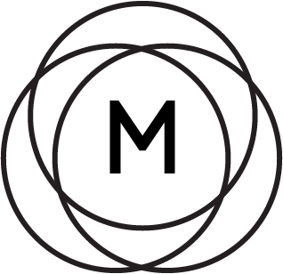
First, some background. The first letter I built was a lowercase _i_ since it's the first letter on the card. Here's an image of that character.
The next letter I built was the lowercase [o]. I based this letter on the first character I made. The height of the outer circle of the [o] is matched to the height of the "stem" of the [i]. The stroke of both letters is matched as well.
These constraints forced the "hole" in the [o] to be smaller than the stroke width of the characters. Remember this for later!
I designed most of the other letters in a similarly logical manner. Stroke width was locked by the [i], max height was set to the top of the dot, and "base" dimensions were locked to the [o]. See below for examples of [b], [c], and [n].
Most of the letters went by without incident, but I had trouble with [e] and [s] as I tried to hold true to my constraints. I couldn't figure out how to fit in the negative space of the [e] or the bend of the [s]. Let's turn to Futura Bold to try and gain some perspective. Paul Renner seemed to have plenty of space for the geometry that was confounding me. Did he follow the same rules?
Whoa, damn. Not at all. I guess that makes sense - there's just not enough space to follow the stroke width and height constraints that I artificially imposed. The Futura [e] has a narrower upper and lower section to make room for the taller area needed by the stacked negative space and horizontal bar of the letter.
Let's go back to my font and look at it again. The [o] is built of two distinct spatial blocks (highlighted in red and blue below). Let's define some units: the red block is "one stroke" and let's call the blue block "one nub". The "nub" unit is a driven dimension - that is, it's a value we ended up with after constraining the height and the stroke width. Turns out that one "nub" is about 0.8x of one "stroke" - one "stroke" is about 1.25x one "nub"). The [o] is 2 strokes + 1 nub in both X and Y (it's a circle). If we just convert to "nubs", this means that my circular [o] is 3.5 nubs tall.
The problem with the [e] quickly becomes apparent. Let's return to Futura to illustrate the point. If you were to take a vertical slice down the center of a lowercase [e], you would encounter 3 filled areas and 2 pockets of negative space. If you were to follow my initial constraint that every filled area is precisely 1 "stroke" width and every negative space is exactly 1 "nub", you would need 3 "strokes" + 2 "nubs". Converting over to "nubs" only, you would need 5.75 "nubs" of vertical height for a lowercase [e]. But alas! By defining our [o] first, I only left myself 3.5 nubs of space! 5.75 > 3.5; I can't build a lowercase [e] without breaking my own rules.

Again relying on the known-good Futura, we see that this geometric tangle is true for [s] as well.
Are there other letters that could pose a problem? A quick skim also flags [z] - after all, it's just a backwards [s]. [k] and [x] look like they could be problematic, but I think I can get around that by playing with the angles of the legs. So yeah, looks like I'm unlucky in needing [e] and [s] in my design. Hm.


How can I get around this issue without redoing the rest of my alphabet? My font was originally inspired by a graphic from Deus Ex Machina, so I went back to that image for reference. Looks like they angle the crossbar in the [e] to fit it in the bounding box. They also squish the sides of their [s], but most importantly they're not following any rules about uniform negative space dimensions.

Following Deus' lead, I cooked up a satisfactory [e]. I kept the height consistent with the defining [o], but I relaxed the width constraint a bit to keep the new letter from looking too crunched.
Okay, [e] is under control. [s], however, continued to vex me for hours and hours.
